The time and effort it takes to make a decision increases with the number of options presented. Sometimes this is also known as decision paralysis or analysis paralysis.
When customers have too much choice the cognitive load is high. For example, a company offering 3 credit cards may find they get higher take-up than a competitor company offering 15 cards.
Brands need to consider the total amount of mental effort that is required from a user (cognitive load) to complete a task, otherwise the user may bounce right off the website altogether!
At the root of the problem is the fear of making the wrong choice and perhaps missing out on a better deal, but more seriously, the concern that the wrong choice will lead to something bad happening (I end up with unmanageable interest payments).

The starting point of course is ‘it depends’ and ‘context matters’. There’s no simple or obvious answer. Usually, a degree of common sense will provide an initial guide on whether the number of options could be increased or are too many. The middle ground though can be quite large and even that common sense around the boundaries can be tricky as what really counts is what your customers think, not you.
You want to help people find the most relevant product for themselves, and so you often see these days a ‘best for…’ approach. Applied to credit cards you get a:
- ‘best for people who pay off each month’
- ‘best for people transferring from another card’ etc
It improves the discoverability of the most salient product benefits for each individual and further down the line improves your conversion rate.
Another approach is a selection ‘wizard’ where the customer is asked a series of questions resulting in a recommendation for one or a limited number of products.
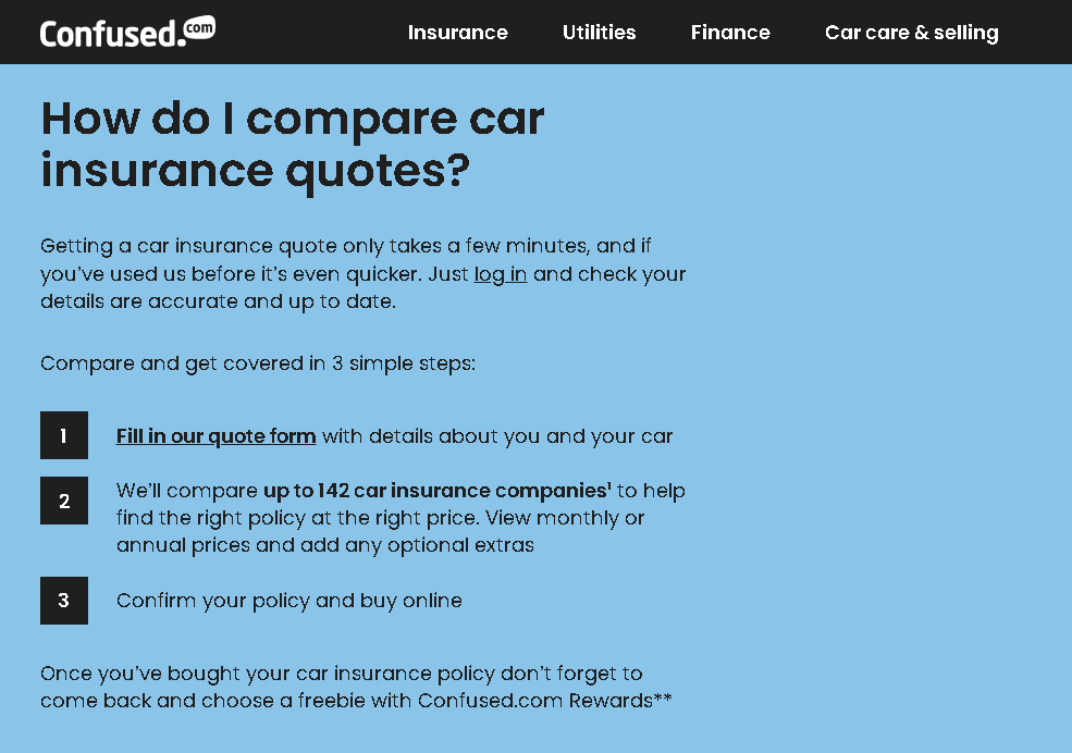
Confused.com use clever techniques like ‘chunking’ to break down the choice process into more manageable sections. Below they set the expectation of the user – there will be three stages in this journey:
Providing filters also helps. ASOS provides lots of information about clothing items in expandable content sections (bottom right of the screenshot below). This looks a lot less daunting for customers and enables them to choose if they want to read more information.
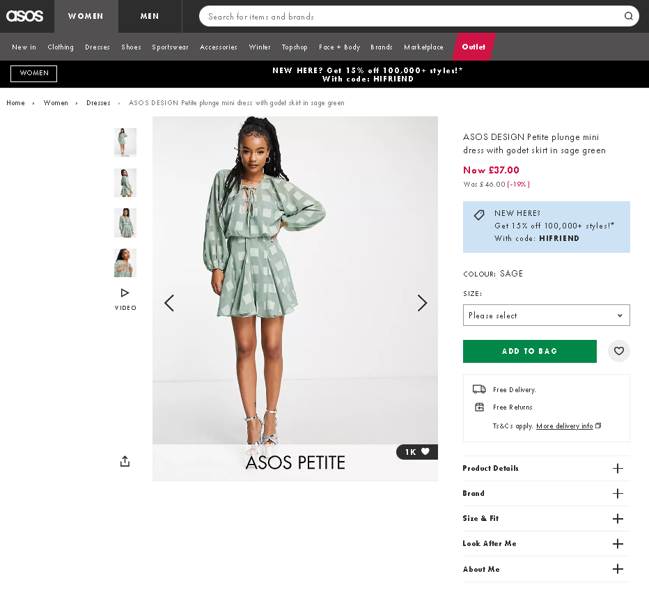
It is important to note that a lot of the magic is in the choice of filters and whether they are configured correctly. If a customer wants to select on material type but it’s not there, then they’ll leave. Equally for other products if the weight of some is listed in kilograms, but for others in pounds, then again you’ll lose sales.
Bear in mind that if you split your content into too many steps and ask users to keep making decisions, they may experience ‘decision fatigue’ and lose the ability to make rational decisions, completely giving up on the purchase.
- Rank your content both in order of importance to you and popularity with your users. Are there any that rank low for both? Could these be removed?
- Study your data or set up tracking for future analysis. Find out which of your options / buttons get clicked the most. Are there any that don't ever get clicked?
- Use ‘best for…’ and wizards, as above.
- Setting a default choice will sometimes influence customers to go with that as it takes the burden of choice away – especially so if it’s marked as ‘best value’ as you see with e.g. magazine subscriptions.
As a fundamental principle think about how you can address that fear of disaster or missing out from making the wrong choice.
Simplifying information is our middle name! Give us a shout if you think any of these would be helpful:
- User Testing with an insights and recommendations report. Asking your customers their opinion is vital for website success.
- High-impact redesign of specific website pages or a customer journey based on best-practice UX principles. You can then implement the designs internally or use our in-house developer resource.
- A fresh, expert perspective of your website. We regularly carry out website reviews using our Dayot heuristic framework. We can look at certain pages or a complete user journey and provide a list of quick wins you can implement internally, or help you set up a testing programme using our in-house expertise.
Contact us at hello@daydot.agency to see how we can help.