In website optimisation, priming is a powerful tool that can be used to influence user behaviour, shape perceptions, and drive engagement by exposing users to a particular stimulus before they engage with a specific task or activity.
The idea is to prepare users for the task by priming their subconscious with relevant information, making them more likely to perform the desired action.
By carefully choosing the right priming cues, designers and marketers can create websites that are more effective at achieving their goals and delivering a great user experience.

If your website goal is to encourage users to sign up for a newsletter you should use language that primes the user to expect valuable information in the newsletter, such as 'Stay in the know with our exclusive updates' or 'Get insider knowledge delivered straight to your inbox.'
Priming can also be used to influence the way users perceive information on a website. By priming users with certain words or images, designers can make them more receptive to specific messages or calls to action. For example, if you want users to make a purchase you might use images and language that prime them to think of the product as high-quality, exclusive, or luxurious.
In the example below you can see that OnTheBeach use the visual on the right and headline promoting ‘FREE Lounge Access & Airport Fast Track’ as a way of priming users to complete the search for a holiday. Users are primed with information OnTheBeach delivers value for money - they will get extras for free so it is worth continuing along the customer journey.

Priming can also be used to encourage users to engage with specific sections or products on a website. For example, if you want to promote a new product line you could prime users to explore the product pages by featuring images and language that suggest the products are innovative, high-quality, or in high demand.
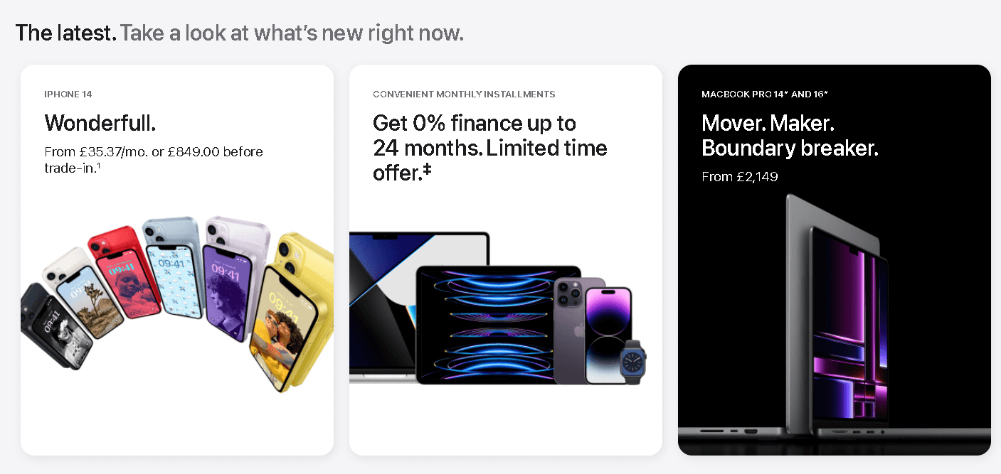
Apple does this on its homepage (on the right in the image below) with the headline 'Mover. Maker. Boundary breaker'.

- Are there certain tasks or actions on your website that always perform better than others? What stimulus are you using on those pages that could be positively influencing your users to act? Think about how you can learn from this and implement on other pages of your website or customer journey.
- Could you add a question to your usual customer survey to find out what influences them when making a decision about your product/service?
- If you simply don’t have the analytics or customer research to inform your strategy it's still worth getting your team together to brainstorm ideas for priming stimulus. Remember to always test any ideas though, be sure you don't start rolling out website changes based on assumptions.
- We can run plan and run User Testing for you to identify the most appropriate priming cues to influence your users’ behaviour and presenting our recommendations in a handy report.
- Using the identified priming cues we can then plan and implement A/B tests to help you achieve your website page objectives, demonstrating the power of testing and optimisation.
Contact us at hello@daydot.agency to see how we can help.